
In this post, I will show some examples of how to summarize and display data.
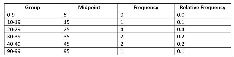
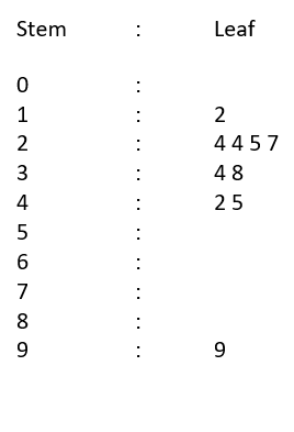
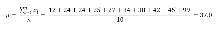
[Example 1] Age of each person in a group (10 people)
- Data Set: [ 24, 45, 12, 34, 24, 27, 38, 25, 42, 99 ]
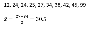
- Data sorted in ascending order: [ 12, 24, 24, 25, 27, 34, 38, 42, 45, 99 ]
- Frequency Table / Relative Frequency Table
- Histogram

- Stem-and-Leaf Diagram
- Mean
- Median
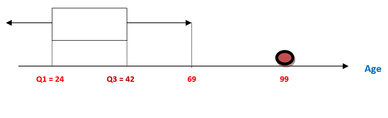
- Inter-Quartile Range (IQR)
Low Group = 12, 24, 24, 25, 27
High Group = 34, 38, 42, 45, 99
Q1 = 24, Q3 = 42
IQR = Q3 – Q1 = 42 – 24 = 18
- Box
From Q1 to Q3 -> 24 ~ 42
- Whiskers
(Q1 – 1.5IQR) ~ Q1 -> -3 ~ 24
Q3 ~ (Q3 + 1.5IQR) -> 42 ~ 69
99 is an outliner.
- Variance / Standard Deviation
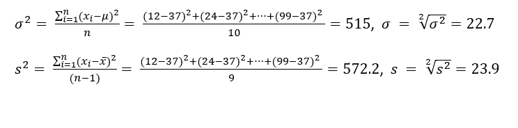
- Z-values
12 : (12-37)/22.7 = -1.10
24 : (24-37)/22.7 = -0.57
25 : (25-37)/22.7 = -0.52
27 : (27-37)/22.7 = -0.44
34 : (34-37)/22.7 = -0.13
38 : (38-37)/22.7 = 0.044
42 : (42-37)/22.7 = 0.22
45 : (45-37)/22.7 = 0.35
99 : (99-37)/22.7 = 2.73
24, 25, 27, 34, 38, 42, and 45 are located within ONE Standard deviation.
12 is located within TWO Standard deviation.
[Example 2]
You are applying for a job in the Company A and you are told that the average salary of the company is $50,000 and the standard deviation is $10,000. If the salary distribution is bell-shaped, how can you interpret this data?
Using the empirical rule, you can find out that 68 % of the employee makes between $40,000 and $60,000. Also most employees (95%) earn between $30,000 and $70,000 per year.
