There are various ways to show your data to others. It is important how to organize and process data, but it is vital to show your data in a clear format so that your audience can get the idea right away. It is always a better idea to use present your data graphically using tables and charts.
| Numerical Data | Categorical Data |
| Tables Histograms | Tables Pie Charts Bar Graphs Time Charts (Line Graphs) |
Tables
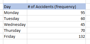
Frequency Table
- A tabulation of the values in a sample
- Interval or group: division of data
- Frequency: the count of occurrences of values
Relative Frequency Table
- Relative frequency is the proportion of all given values in an interval.
Charts and Graphs
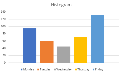
Histogram
- A graphical representation of the distribution of data or a frequency table
Stem-And-Leaf Diagram
- Quantitative data (usually sorted) in a graphical format
- Determine what the stems will represent and what the leaves will represent
- Typically, the leaf contains the last digit of the number, and the stem contains all of the other digits.
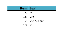
Here is the example of the stem-and-leaf diagram.
The height of 10 students are like this in centimeters:
178, 159, 166, 175, 182, 162, 173, 175, 172, 178
In this example, the stem can be the first 2 digits and the leaf will be the last digit. Also, when you specify the leaf values, you need to specify the repeated values.
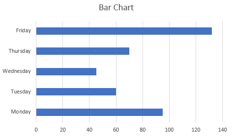
[Note] In most graphs, an independent variable goes on the horizontal axis (x-axis), and a dependent variable goes on the vertical axis (y-axis). But the bar graph is an exception. In it, the vertical axis holds the independent variable.